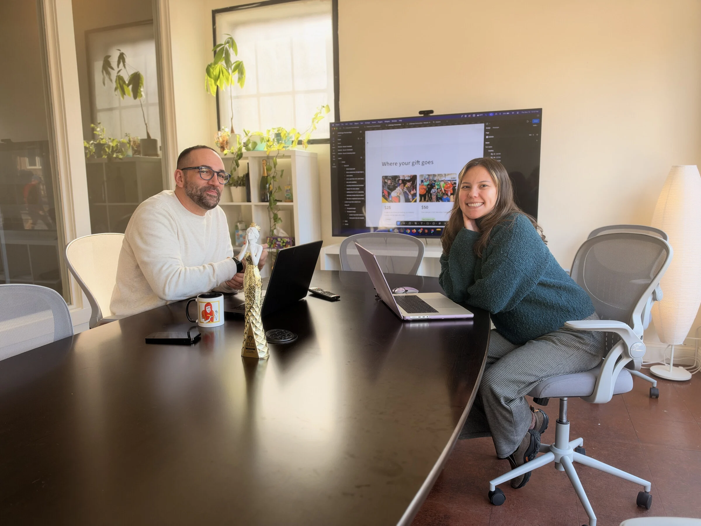
The Seafoam website won Gold for website design at the 2026 MUSE Creative Awards (opens in a new tab), in the Website – Design / Web Agency category. The entry was titled “Seafoam website: A revenue system, held to your number.”
We’re pleased, and we’d also rather spend this post on the decision behind the site than on the trophy, because it’s something you can check against your own website in about ten minutes.
What we changed about how the site is organized
Seafoam rebuilt its own website in 2026 to match a new position: a marketing department for mid-market companies, measured on revenue instead of activity. The live site launched in August.
The usual way to build an agency site is a menu of what the agency sells. Services across the top, a page for each, and the visitor is left to work out which one applies to them. We built ours around the problems owners actually bring us, so a visitor finds their own situation first and the services second.
Our problems pages are where that starts. Outgrown Your Agency is one example: it’s written for someone who has decided the current setup won’t get the company to its next goal, and it goes on from there to the solution that fits.
Why a problem-first site matters if you run the company
You’ve probably been the person on the other side of an agency website. You land on a list of services, each one described in the vendor’s own vocabulary, and you can’t tell which of them has anything to do with the number you’re trying to hit. That’s a lot of work to ask of someone who just wants to know whether these people understand his situation.
The same thing happens to your customers on your site. They arrive with a problem in their own words. If the first thing they meet is your org chart or your product catalog, they have to translate, and some of them won’t bother.
The two-click rule we held ourselves to
Each problem on our site connects to solutions, goals and client proof in two clicks or fewer. The reasoning is simple: someone who recognizes their situation should be able to see what we’d do about it and what happened for a company like theirs without hunting through menus.
That matters more than it sounds, because many of the people who read a site like ours are the operations lead, the office manager or the sales director who was handed marketing and is screening options before anything reaches the owner. A page that works for them has to make sense on its own, and it has to get to the proof fast.
Try it on your own site
Open your website as if you were a customer with one specific problem, and run these checks:
- Can you find that problem named on the page, in words a customer would use?
- How many clicks does it take to get from there to what you’d do about it?
- How many more to reach a real result for a company like theirs?
If any of those takes more than a couple of clicks, or sends the visitor through your internal service names, that’s the first thing to fix. Our web design work starts with that same question, before anything gets drawn.
The four people who built it
The site came out of a small team: Jason Kanzler (Creative Director), Cenna Mawhinney (Designer), Ryan Foizey (Director of Strategic Development) and Allie Wolf (Digital Marketing Strategist). Thank you to all four. If you’ve read our earlier MUSE wins for client websites, you’ll know this one is the first where the client was us, so this time we applied the problem-first test to our own site before asking you to apply it to yours.